Year
2025
Client
Houston Health Department
Category
Product Duration
4-6 Months
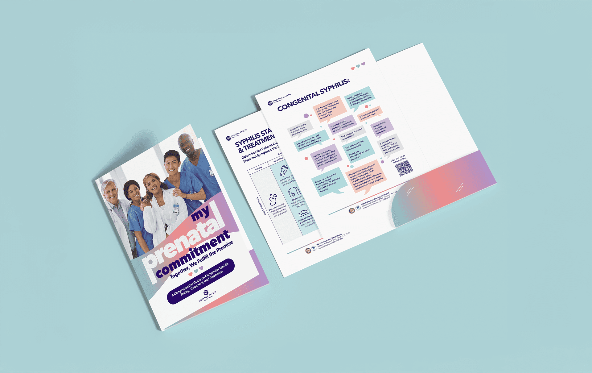
Before diving into design, I collaborated closely with our copywriter and consulted with public health professionals to better understand the toolkit’s audience: doctors, nurses, and frontline healthcare workers. Their feedback helped us shape the format of the toolkit itself. Originally envisioned as a bound booklet, we pivoted after learning how important flexibility and quick access were in real clinical settings. Many healthcare providers preferred loose, one-sheet inserts they could carry, photocopy, or quickly refer to on the job. That insight fundamentally shaped our format. We developed a custom folder system that housed individual cards and handouts organized by topic.
The content included:
Syphilis stages and progression tables
Patient talking points
Background on congenital syphilis
Treatment protocol charts
Testing recommendations and reminders
We began with several visual concepts, each attempting to solve a slightly different challenge. The first version featured a deep blue background overlaid with color-blocked squares, shapes, and a monochrome image of a single healthcare provider. While visually striking, it was ultimately too busy and limiting. Because it featured only one doctor, it unintentionally narrowed the audience instead of welcoming a diverse, collaborative medical community.
Another concept focused on a smiling baby against soft, gradient-colored panels of doctors and patients. Visually, it was clean and emotionally engaging. However, feedback from the client made it clear this campaign needed to speak directly to physicians, not patients or the general public. Leading with a baby, even if thematically relevant, sent the wrong message and risked emotionalizing a campaign meant to encourage professional responsibility and action.
These rounds were invaluable. They helped clarify the tone we truly needed: a design that positioned doctors as both the audience and the heroes of the story without falling into clichés or overwhelming visuals.
The final direction focused on a friendly yet professional aesthetic. We used soft pastel gradients to convey warmth, trust, and clarity, anchored by clean typography and approachable iconography. The bold, rounded typefaces reinforced accessibility while maintaining a modern polish. A diverse group of healthcare providers was featured prominently, with relaxed body language and genuine expressions, signaling inclusion and collaboration.
One key motif, the flowing wave shape, became a design thread that unified all campaign materials. From the toolkit to the website and printed banners, it subtly reinforced the idea of progress and partnership. Every choice, from layout rhythm to icon styling, was made with the goal of giving doctors quick, clear access to the information they needed, in a design system that felt made for them.

It took some fine-tuning to make sure the tone wasn’t too cold or too corporate. I resolved this challenge by designing with intention. Using color, shape, and layout to soften the feel without losing credibility. I also paid close attention to how visual information was organized. The toolkit’s layout emphasized easy readability, spacing, and logical grouping to reduce cognitive overload and help healthcare providers find what they needed quickly.
Once the toolkit was finalized, I extended the campaign system across multiple platforms. These included:
A branded landing page with a toolkit download and physician pledge
Email templates for outreach and campaign updates
Social media graphics for organic and paid promotion
Event banners and promotional postcards
Each piece followed the established style, ensuring consistency across all touchpoints, digital or physical.
The campaign was a success on both a strategic and visual level. Toolkit downloads and pledge signups exceeded initial expectations. The Houston Health Department also tracked social media reach, email engagement, and digital ad performance, all pointing to strong campaign resonance.
Internally, the client praised how the design managed to balance visual warmth with practical function. Compared to their original materials, which were generic and disjointed, the new identity was unified, engaging, and easy to distribute. The toolkit became a point of pride, used in physician trainings, community events, and hospital outreach.
My Prenatal Commitment stands out as a project where strategic design truly elevated public health communication. By combining human-centered visuals with information architecture tailored to real-world use, we helped turn a static resource into a living tool for change.
The impact was tangible — not just in design metrics, but in the lives of patients and physicians it aimed to support.