Year
2021
Client
Gonzalez Realty
Category
Product Duration
4 Weeks
From the start, Karen made one thing clear: she was building more than a logo. This was the beginning of her agency’s next chapter. She wanted an identity that not only made her proud, but one that attracted ambitious agents and inspired trust in first-time homebuyers.
We kicked things off with an in-depth discovery session to map out her vision, frustrations, and future goals. We talked about her clients, her team, and where she wanted the brand to go. One major insight: Gonzalez Realty was about guidance, not just transactions. The brand needed to feel warm, informed, and supportive.
I also took a close look at the landscape of Houston real estate branding. Overused stock icons, house silhouettes, and navy-and-gold combos dominated the scene. It was time to bring something more intentional to the table, one that hinted at professionalism without feeling stiff or corporate.
The brand direction started with moodboarding inspiration from outside real estate: luxury skincare, boutique architecture firms, and editorial design. I wanted to find that balance between sophistication and soul.
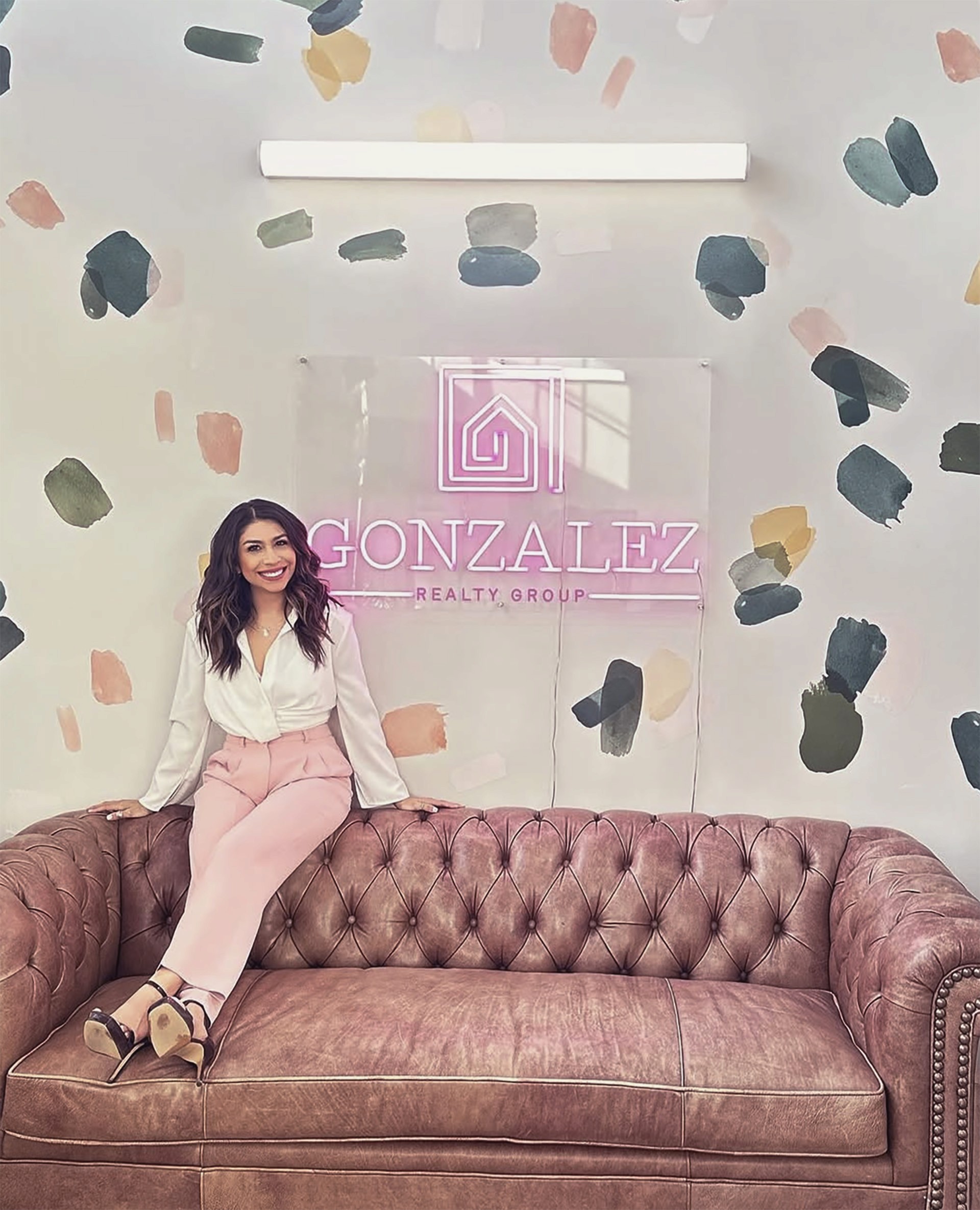
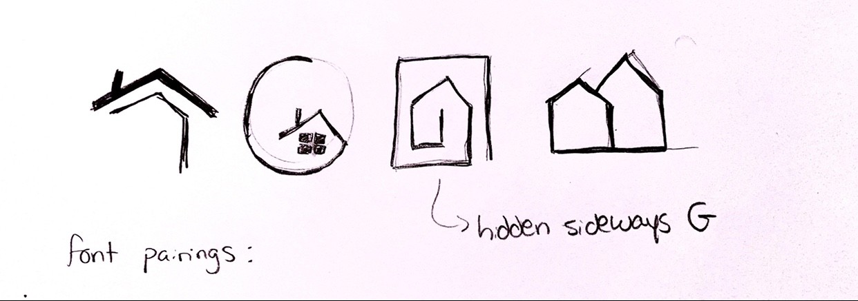
I started with dozens of sketches and narrowed them down to three strong concepts to avoid overwhelming Karen with too many options. One idea stood out early on—a sideways “G” forming the outline of a family home. It was a subtle nod to both her name and her mission, and it gave the logo a sense of cleverness without being over the top.
From there, I paired a classic serif typeface with a structured geometric sans serif to mirror the “modern meets timeless” vibe we were aiming for. That pairing helped set the tone for everything else to come, from yard signs to email headers.
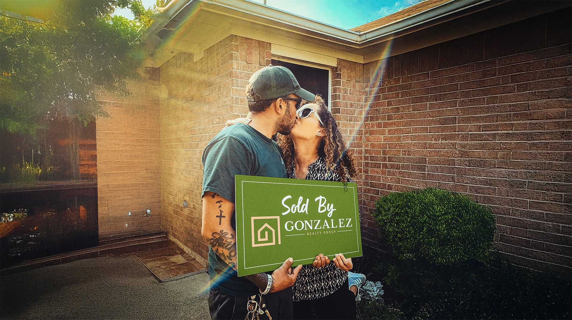
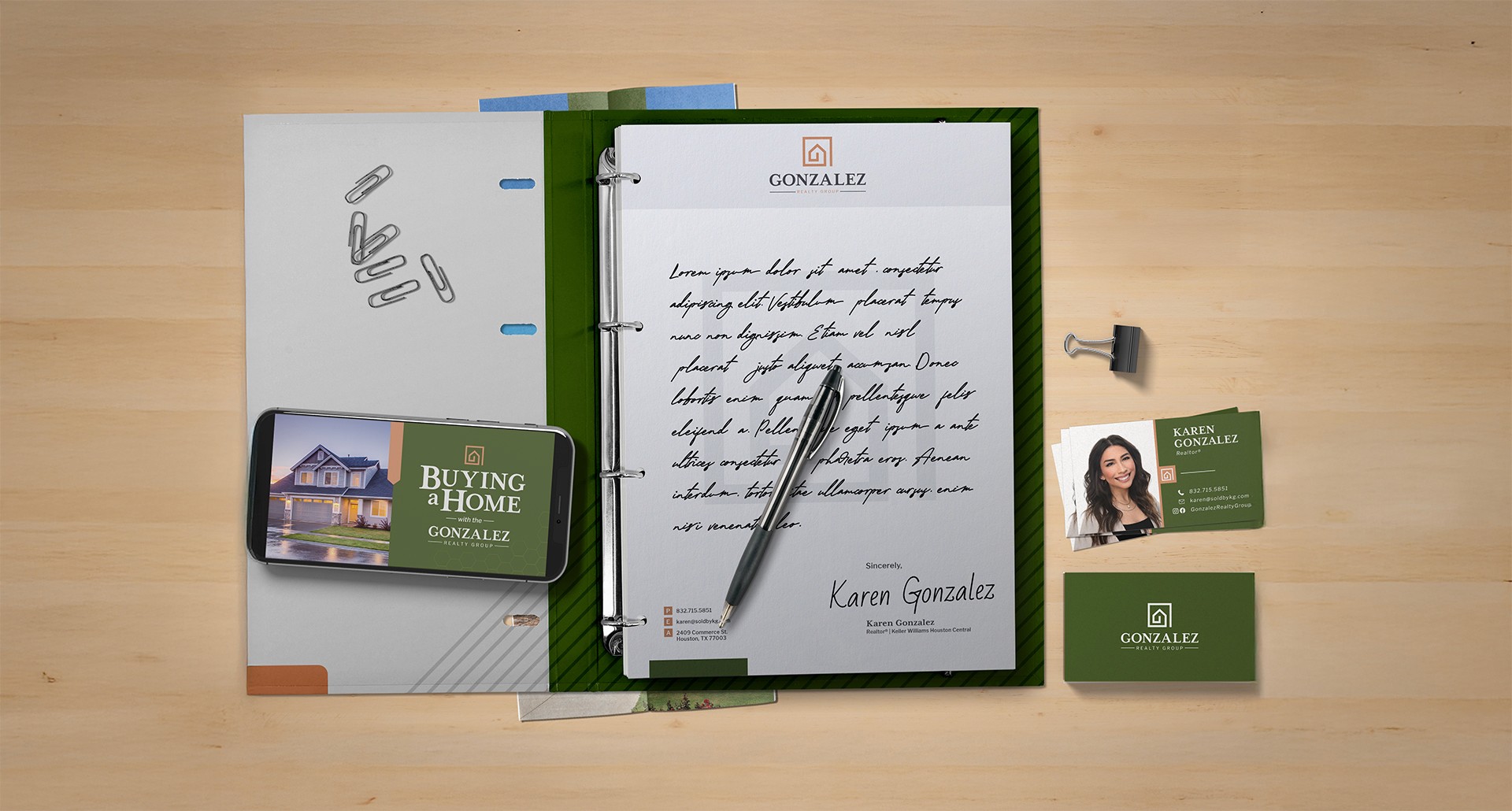
After refining the final logo, I developed a full identity system around it. We chose a custom salmon and forest green color palette, drawing inspiration from fresh-cut lawns and inviting interiors. These colors brought warmth and character, while still feeling grounded and professional.
The biggest challenge was hitting the right tone visually. Karen didn’t want to come off as cold or corporate, but the brand also needed to feel elevated. I resolved this with thoughtful spacing, soft neutral tones, and layout designs that gave the logo room to breathe. This extended into everything from business cards and stationery to branded “Just Sold” signs and social media graphics.
To keep things scalable, I delivered a comprehensive brand guide covering logo usage, color codes, font systems, and examples of branded collateral in action. This became a key tool as Karen onboarded new team members and delegated marketing tasks.
Seeing the final brand come together was a turning point. Karen finally had a business identity that matched her expertise. The logo wasn’t just a symbol—it was a conversation starter. Clients and peers picked up on the hidden “G,” and it became something she proudly shared whenever she handed out a card or sent a newsletter.
The branding rollout went well beyond just visuals. I created a custom-coded Mailchimp newsletter template so she could easily update her audience with listings and news. Her new letterheads allowed her to write handwritten notes to clients, which gave the experience a more personal, human touch.
Since launching the new identity, Karen has grown her business significantly. She’s now a top 5% producer in Texas with over 10,000 social media followers, a growing team, and a far more cohesive marketing presence across all platforms. From yard signs to baby onesies (yes, really), we’ve extended the branding into just about everything.
This project reminded me that good design doesn’t just “look nice”—it has the power to energize people, transform how they show up, and open new doors they may not have even envisioned for themselves.